Pattern Demo

This page shows all 18 ntgt-patterns with an explanation of how to use them and rendered examples.

Content 1

Path: ntgt-patterns/content-1/content-1.liquid

A basic content section with a heading, text and buttons. The content can be center or left-aligned. Each button can link, open a new tab or open a modal. You can also set the prominence of each button (primary or secondary). You can set the size of the buttons (small, medium, large). This content pattern was originally intended for use with grid-1 pattern. It will fill the height of the parent container if it is not the tallest element in the grid row. The content will be vertically centered.

Ready to give Your Pet the Best?

Don't wait – book your pet's grooming appointment today or use our quick pricing calculator to get an estimate.

Example 1

Example usage of Content 1 template with a heading, rich text content, and two buttons.

Example Props:
{
  "colorContext": "neutral-shaded",
  "inlineAlignment": "center",
  "paddingInline": "7",
  "paddingBlock": "7",
  "textMarginBs": "4",
  "buttonsMarginBs": "5",
  "buttonSize": "small",
  "buttonGap": "5",
  "heading": {
    "tag": "h3",
    "class": "h3",
    "color": "vibrant",
    "text": "Ready to give Your Pet the Best?"
  },
  "contentRichText": "<p><strong>Don't wait –</strong> book your pet's grooming appointment today or use our quick pricing calculator to get an&nbsp;estimate.</p>",
  "buttons": [
    {
      "text": "Open Modal",
      "target": "#some-modal-id",
      "behavior": "modal",
      "prominence": "primary"
    },
    {
      "text": "Link to Page",
      "target": "/some/page/",
      "behavior": "new-tab",
      "prominence": "secondary"
    }
  ]
}
Props

Pass these props to control the content and settings.

  • colorContext [string] | default: neutral-shaded
    The color context applied to the content container. It defines the background and text colors. (e.g. 'neutral-shaded', 'neutral-light')
  • inlineAlignment [string] | default: center
    The inline (horizontal) alignment of the text. (e.g. 'center', 'start')
  • paddingInline [string] | default: 7
    The horizontal padding for the content section. Uses spacing units (e.g. '5', '7'). On xs, this is ignored and the container inline padding is used instead.
  • paddingBlock [string] | default: 7
    The vertical padding for the content section. Uses spacing units (e.g. '5', '7').
  • textMarginBs [string] | default: 4
    The margin above the text (below the heading).
  • buttonsMarginBs [string] | default: 4
    The margin above the buttons.
  • buttonSize [string] | default: small
    The size of buttons. (e.g. 'small', 'medium', 'large')
  • buttonGap [string] | default: 4
    The gap between buttons in the button container. Uses spacing units.
  • heading [object]
    Settings for the heading.
    Object Props:
    • tag [string] | default: h3
      The HTML tag for the heading. (e.g. 'h2', 'h3')
    • class [string] | default: h3
      CSS class applied to the heading, determining its styling. (e.g. 'h2', 'h3')
    • color [string] | default: vibrant
      The color context of the heading text. (e.g. 'vibrant', 'normal')
    • text [string] | required
      The text content of the heading. Supports HTML entities like   for text formatting.
  • contentRichText [string]
    Rich text content displayed below the heading. May include basic HTML tags like b, strong, em, a, etc.
  • buttons [array]
    An array of button objects representing action buttons.
    button [object]
    Object Props:
    • text [string] | required
      The text of the button.
    • target [string] | required
      The target link or modal ID. (e.g. '/page/', '#modal-id')
    • behavior [string] | required
      Specifies the button's behavior: opens a link, a new tab, or a modal. (e.g. 'link', 'new-tab', 'modal')
    • prominence [string] | default: primary
      The prominence of the button, indicating its styling. (e.g. 'primary', 'secondary')

Content 2

Path: ntgt-patterns/content-2/content-2.liquid

A flexible content block with configurable padding and rich text content display. Useful as a child block of grid-2. Expects the html output of a rich text editor with tags like h2, a, p, strong, em, ul, li, etc.

Heading Two

Some Strong Text
Lorem ipsum dolor sit amet, consectetur adipiscing elit. Etiam odio lectus, condimentum sit amet luctus sed, consequat et tortor. Etiam non tortor eu nunc euismod aliquet vitae a odio. Quisque vehicula, odio pharetra vehicula fermentum, tortor turpis hendrerit dui, non dapibus elit erat in arcu.

Default Example

Displays content with specific padding and a sample rich text HTML structure.

Example Props:
{
  "paddingBlockStart": "6",
  "paddingBlockEnd": "7",
  "textAlign": "start",
  "contentRichText": "<h2>Heading Two</h2><p><strong>Some Strong Text</strong><br />Lorem ipsum dolor sit amet, consectetur adipiscing elit. Etiam odio lectus, condimentum sit amet luctus sed, consequat et tortor. Etiam non tortor eu nunc euismod aliquet vitae a odio. Quisque vehicula, odio pharetra vehicula fermentum, tortor turpis hendrerit dui, non dapibus elit erat in arcu.</p>"
}
Props

Pass these props to control the content and settings.

  • paddingBlockStart [string] | default: 0
    The top padding of the block, defined in spacing units. (e.g., 6)
  • paddingBlockEnd [string] | default: 0
    The bottom padding of the block, defined in spacing units. (e.g., 6)
  • contentRichText [string] | required
    Rich text content displayed within the block. Allows HTML tags for formatting such as h2, p, br, strong, a, ul, li.

Content 3

Path: ntgt-patterns/content-3/content-3.liquid

A content block with customizable padding, alignment, and headings. Includes options for a small heading, a large heading, and a paragraph, all with styling options. Intended to be used as a child block of grid-2 or something similar.

Services

Comprehensive Grooming
for Your Beloved Pet

At Pet Love, we understand that every pet is unique, and so are their grooming needs. Our comprehensive range of services ensures that your furry friend looks and feels their best, all from the comfort of your home.

Example 1

A content block with both headings and a paragraph.

Example Props:
{
  "paddingBlockStart": "5",
  "paddingBlockEnd": "5",
  "textAlign": "center",
  "smallHeading": {
    "tag": "h2",
    "class": "h4",
    "color": "vibrant",
    "text": "Services",
    "textTransform": "uppercase",
    "marginBlockEnd": "4"
  },
  "largeHeading": {
    "tag": "h1",
    "class": "h2",
    "color": "normal",
    "text": "Comprehensive Grooming<br />for Your Beloved Pet",
    "marginBlockEnd": "4"
  },
  "paragraph": {
    "color": "normal",
    "text": "At Pet Love, we understand that every pet is unique, and so are their grooming needs. Our comprehensive range of services ensures that your furry friend looks and feels their best, all from the comfort of your home."
  }
}
Props

Pass these props to control the content and settings.

  • paddingBlockStart [string] | default: 0
    The amount of padding applied at the start of the block. Uses spacing units. (e.g., 0, 5)
  • paddingBlockEnd [string] | default: 0
    The amount of padding applied at the end of the block. Uses spacing units. (e.g., 0, 5)
  • textAlign [string] | default: center
    Text alignment for the content within the block. (e.g., 'start', 'center')
  • smallHeading [object]
    Settings for the small heading. If you leave the text field empty, the heading will not be displayed.
    Object Props:
    • tag [string] | default: h2
      The HTML tag used for the small heading. (e.g., 'h2', 'h3')
    • class [string] | default: h4
      CSS class applied to the small heading. (e.g., 'h4', 'h5')
    • color [string] | default: vibrant
      The color of the small heading. (e.g., 'vibrant', 'normal', 'subdued', 'xsubdued')
    • textTransform [string]
      Text transformation for the small heading. (e.g., 'uppercase')
    • marginBlockEnd [string] | default: 1
      Margin applied after the small heading. Uses spacing units. (e.g., 1, 3)
    • text [string]
      The text content of the small heading.
  • largeHeading [object]
    Settings for the large heading. If you leave the text field empty, the heading will not be displayed.
    Object Props:
    • tag [string] | default: h2
      The HTML tag used for the large heading. (e.g., 'h1', 'h2')
    • class [string] | default: h1
      CSS class applied to the large heading. (e.g., 'h1', 'h2')
    • color [string] | default: normal
      The color of the large heading. (e.g., 'normal', 'vibrant', 'subdued', 'xsubdued')
    • marginBlockEnd [string] | default: 3
      Margin applied after the large heading. Uses spacing units. (e.g., 3, 5)
    • text [string]
      The text content of the large heading.
  • paragraph [object]
    Settings for the paragraph.
    Object Props:
    • color [string] | default: normal
      The color of the paragraph text. (e.g., 'normal', 'vibrant', 'subdued', 'xsubdued')
    • text [string]
      The text content of the paragraph.

Feature 1

Path: ntgt-patterns/feature-1/feature-1.liquid

A feature block with an image (probably a graphic) with transparent background, heading, paragraph, and a button. Includes customizable paddings, margins, and border styles. The graphic should be cropped tightly.

calculator

Estimate Your Pet's Grooming Costs

We understand that budgeting for pet grooming is important. Our interactive pricing calculator helps you estimate the cost of our services based on your pet's specific needs. Get a clear idea of what to expect without any surprises.

Example Usage

Demonstrates the use of all props in a feature block.

Example Props:
{
  "colorContext": "neutral-light",
  "heading": {
    "tag": "h3",
    "class": "h6",
    "color": "normal",
    "text": "Estimate Your Pet's Grooming Costs",
    "marginBlockEnd": "0"
  },
  "paragraph": {
    "text": "We understand that budgeting for pet grooming is important. Our interactive pricing calculator helps you estimate the cost of our services based on your pet's specific needs. Get a clear idea of what to expect without any surprises.",
    "color": "normal"
  },
  "button": {
    "text": "Calculate Estimate",
    "target": "#some-link",
    "size": "small",
    "behavior": "link",
    "prominence": "secondary",
    "marginBlockStart": "5"
  },
  "image": {
    "url": "/assets/img/graphics/calculator-1.svg",
    "alt": "calculator"
  },
  "border": {
    "radius": "7",
    "width": "1",
    "color": "vibrant"
  },
  "paddingBlock": {
    "xs": "6",
    "lg": "7"
  },
  "boxPaddingBlock": {
    "xs": "6",
    "lg": "7"
  },
  "boxPaddingInline": {
    "xs": "6",
    "md": "7",
    "lg": "8"
  },
  "gap": {
    "xs": "6",
    "lg": "7",
    "xl": "8"
  },
  "imageMaxInlineSize": {
    "xs": "8rem",
    "md": "10rem"
  }
}
Props

Pass these props to control the content and settings.

  • colorContext [string] | default: neutral-light
    The color context applied to the container. It defines the background and text colors. (e.g., 'neutral-light', 'neutral-shaded')
  • heading [object]
    Settings for the heading element.
    Object Props:
    • tag [string] | default: h3
      The HTML tag used for the heading (e.g., h3, h4).
    • class [string] | default: h6
      CSS class applied to the heading for size and style.
    • color [string] | default: normal
      The color of the heading text (e.g., normal, vibrant).
    • text [string] | required
      The text content of the heading. If left blank, the heading will not be displayed.
    • marginBlockEnd [string] | default: 0
      Bottom margin applied to the heading element.
  • paragraph [object]
    Settings for the paragraph element.
    Object Props:
    • text [string] | required
      The text content of the paragraph. If left blank, the paragraph will not be displayed.
    • color [string] | default: normal
      The color of the paragraph text.
  • button [object]
    Settings for the button. The button text and target must be provided or the button will not be displayed.
    Object Props:
    • text [string] | required
      The button text.
    • target [string] | required
      The URL or modal ID selector the button points to (e.g. /some/page/ or #some-modal).
    • size [string] | default: small
      The size of the button (e.g., small, medium, large).
    • behavior [string] | default: link
      The button's behavior (e.g., link, new-tab, modal).
    • prominence [string] | default: secondary
      The prominence of the button (e.g., primary, secondary).
    • marginBlockStart [string] | default: 5
      Top margin applied to the button parent div.
  • image [object]
    Settings for the image displayed in the feature.
    Object Props:
    • url [string] | required
      The URL of the image (e.g. /assets/img/graphics/some-graphic.svg).
    • alt [string] | required
      The alt text for the image. Good for SEO and accessibility.
  • border [object]
    Settings for the border around the content box.
    Object Props:
    • radius [string] | default: 7
      The border radius value. Uses our border radius scale (e.g. 0, 1, 2)
    • width [string] | default: 1
      The border width value. Uses our line width scale (e.g. 0, 1, 2)
    • color [string] | default: normal
      The color of the border (e.g. normal, vibrant, subdued, xsubdued).
  • paddingBlock [object]
    Block (vertical) padding outside the bordered box. Think mobile first. Start with xs and set only values where it needs to change. You can set other breakpoint values to empty string or just leave them out.
    Object Props:
    • xs [string] | default: 6
      Padding value for extra small screens.
    • sm [string]
      Padding value for small screens.
    • md [string]
      Padding value for medium screens.
    • lg [string] | default: 7
      Padding value for large screens.
    • xl [string]
      Padding value for extra large screens.
  • boxPaddingBlock [object]
    Block (vertical) padding inside the bordered box. Think mobile first. Start with xs and set only values where it needs to change. You can set other breakpoint values to empty string or just leave them out.
    Object Props:
    • xs [string] | default: 6
      Padding value for extra small screens.
    • sm [string]
      Padding value for small screens.
    • md [string]
      Padding value for medium screens.
    • lg [string] | default: 7
      Padding value for large screens.
    • xl [string]
      Padding value for extra large screens.
  • gap [object]
    Grid gap settings. Think mobile first. Start with xs and set only values where it needs to change. You can set other breakpoint values to empty string or just leave them out.
    Object Props:
    • xs [string] | default: 6
      Gap value for extra small screens.
    • sm [string]
      Gap value for small screens.
    • md [string]
      Gap value for medium screens.
    • lg [string] | default: 7
      Gap value for large screens.
    • xl [string] | default: 8
      Gap value for extra large screens.
  • imageMaxInlineSize [object]
    Maximum inline size (width) settings for the image. Adjustable at breakpoints. Think mobile first. Start with xs and set only values where it needs to change. You can set other breakpoint values to empty string or just leave them out.
    Object Props:
    • xs [string] | default: 8rem
      Maximum inline size for extra small screens.
    • sm [string]
      Maximum inline size for small screens.
    • md [string] | default: 10rem
      Maximum inline size for medium screens.
    • lg [string]
      Maximum inline size for large screens.
    • xl [string]
      Maximum inline size for extra large screens.

Grid 1

Path: ntgt-patterns/grid-1/grid-1.liquid

This grid lays out two blocks in a half and half layout on md and up. The blocks are stacked on sm and down. You can reverse the order on md and up. The grid has no gap between blocks.

block 1
block 2
Example 1

A basic example showing the grid layout with two simple color blocks.

Example Props:
{
  "reverseOrderMdUp": true,
  "blocks": [
    {
      "pattern": "ntgt-patterns/content-1/content-1.liquid",
      "props": {
        "colorContext": "accent1-shaded",
        "contentRichText": "block 1"
      }
    },
    {
      "pattern": "ntgt-patterns/content-1/content-1.liquid",
      "props": {
        "colorContext": "accent1-dark",
        "contentRichText": "block 2"
      }
    }
  ]
}
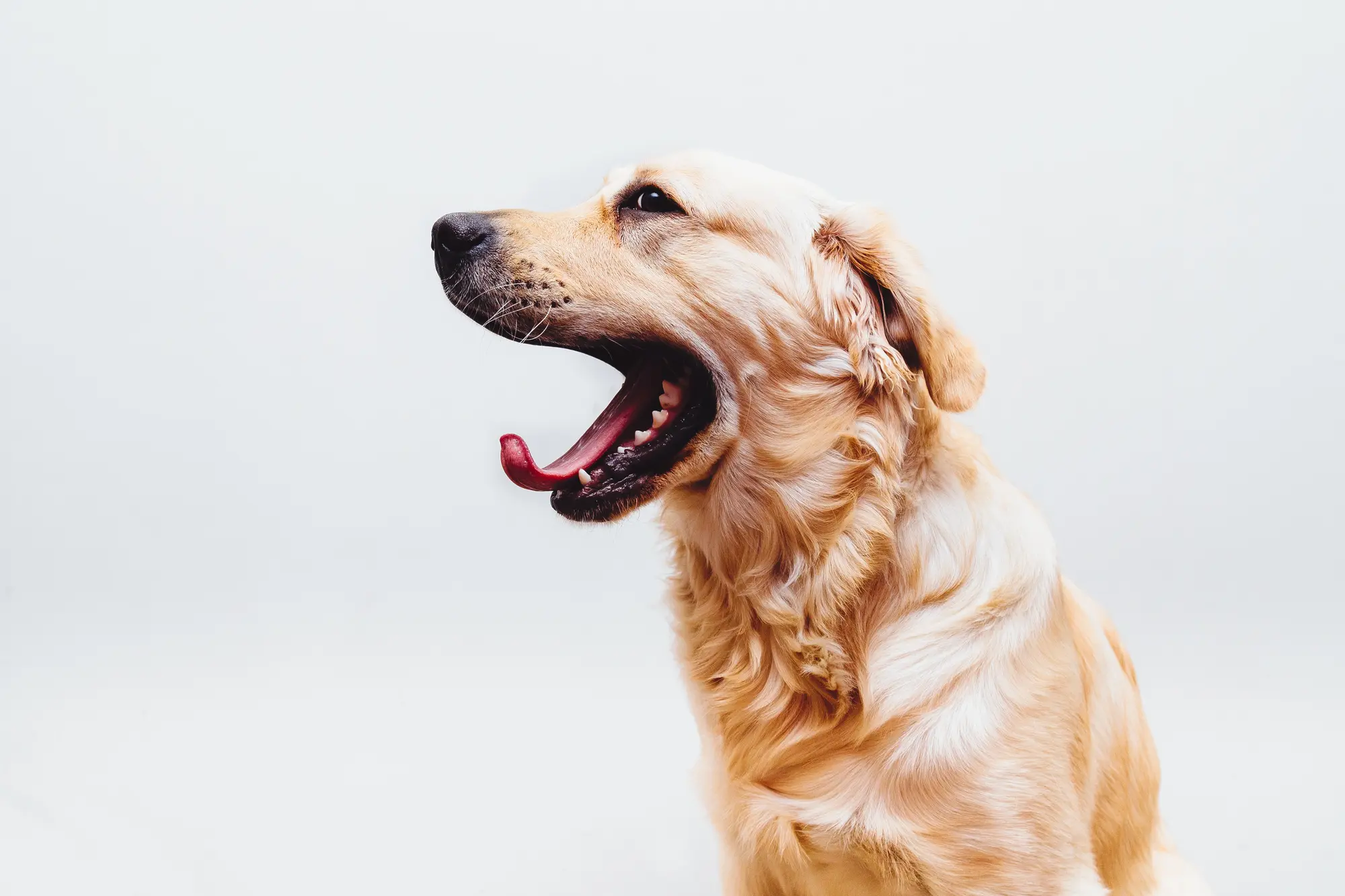
yawning dog

Ready to give Your Pet the Best?

Don't wait – book your pet's grooming appointment today or use our quick pricing calculator to get an estimate.

Example 2

This example shows realistic content: an image-1 block and a content-1 block.

Example Props:
{
  "reverseOrderMdUp": false,
  "blocks": [
    {
      "pattern": "ntgt-patterns/image-1/image-1.liquid",
      "props": {
        "image": "yawning-dog",
        "imageAlt": "yawning dog",
        "imageAspectRatio": {
          "xs": "3/2",
          "sm": "2/1",
          "md": "3/2",
          "lg": "3/2",
          "xl": "3/2"
        },
        "imageObjectPosition": {
          "xs": "center",
          "sm": "center",
          "md": "bottom right",
          "lg": "bottom right",
          "xl": "bottom right"
        }
      }
    },
    {
      "pattern": "ntgt-patterns/content-1/content-1.liquid",
      "props": {
        "colorContext": "neutral-shaded",
        "inlineAlignment": "center",
        "paddingInline": "7",
        "paddingBlock": "7",
        "textMarginBs": "4",
        "buttonsMarginBs": "5",
        "buttonSize": "small",
        "buttonGap": "5",
        "heading": {
          "tag": "h3",
          "class": "h3",
          "color": "vibrant",
          "text": "Ready to give Your Pet the&nbsp;Best?"
        },
        "contentRichText": "<p><strong>Don't wait –</strong> book your pet's grooming appointment today or use our quick pricing calculator to get an&nbsp;estimate.</p>",
        "buttons": [
          {
            "text": "Open Modal",
            "target": "#some-modal-id",
            "behavior": "modal",
            "prominence": "primary"
          },
          {
            "text": "Link to Page",
            "target": "/some/page/",
            "behavior": "new-tab",
            "prominence": "secondary"
          }
        ]
      }
    }
  ]
}
Props

Pass these props to control the content and settings.

  • reverseOrderMdUp [boolean]
    Reverse the order of the blocks on md and up screens.
  • blocks [array] | required
    An array of child blocks, where each block is an object containing a pattern and its associated props.
    block [object]
    Object Props:
    • slot [string]
      The name of the slot in the layout where the block should be placed. (e.g. slot-1)
    • pattern [string] | required
      The path to the Liquid template pattern used for the block. (e.g. ntgt-patterns/content-1/content-1.liquid)
    • props [object] | required
      The props passed to the block's pattern.

Grid 2

Path: ntgt-patterns/grid-2/grid-2.liquid

This grid centers and width-limits a tube of content. You can set block (vertical) padding and row gap to control spacing at the top, bottom and between blocks. You can adjust these spacing values at each breakpoint. Certain simple patterns are designed to be included in this grid: content-2, image-2, etc. Some of these blocks also let you set block padding to add additional spacing above or below the block.

Heading Two

Some Strong Text
Lorem ipsum dolor sit amet, consectetur adipiscing elit. Etiam odio lectus, condimentum sit amet luctus sed, consequat et tortor. Etiam non tortor eu nunc euismod aliquet vitae a odio.

yawning dog

Ipsum dolor sit amet, consectetur adipiscing elit. Etiam odio lectus, condimentum sit amet luctus sed, consequat et tortor. Etiam non tortor eu nunc euismod aliquet vitae a odio.

Temp-Controlled Environment

Ensures your pet is comfortable throughout the grooming process.

Heated Water System

Provides a soothing and warm bath experience.

Advanced Grooming Tools

State-of-the-art equipment for precise and gentle grooming.

Sanitization

Staff thoroughly cleans and sanitizes vans between appointments.

Ipsum dolor sit amet, consectetur adipiscing elit. Etiam odio lectus, condimentum sit amet luctus sed, consequat et tortor. Etiam non tortor eu nunc euismod aliquet vitae a odio.

Example 1

A sample grid with three blocks. The first contains a heading, strong tag, and a paragraph. It could contain more headings and paragraphs. The second is an image. The third is just a paragraph, but could be any combination of headings, paragraphs, lists, etc.

Example Props:
{
  "colorContext": "neutral-light",
  "maxInlineSizeLg": "42rem",
  "paddingBlockStart": {
    "xs": "6"
  },
  "paddingBlockEnd": {
    "xs": "6"
  },
  "rowGap": {
    "xs": "6"
  },
  "blocks": [
    {
      "pattern": "ntgt-patterns/content-2/content-2.liquid",
      "props": {
        "contentRichText": "<h2>Heading Two</h2><p><strong>Some Strong Text</strong><br />Lorem ipsum dolor sit amet, consectetur adipiscing elit. Etiam odio lectus, condimentum sit amet luctus sed, consequat et tortor. Etiam non tortor eu nunc euismod aliquet vitae a odio.</p>"
      }
    },
    {
      "pattern": "ntgt-patterns/image-2/image-2.liquid",
      "props": {
        "image": "yawning-dog",
        "imageAlt": "yawning dog"
      }
    },
    {
      "pattern": "ntgt-patterns/content-2/content-2.liquid",
      "props": {
        "contentRichText": "<p>Ipsum dolor sit amet, consectetur adipiscing elit. Etiam odio lectus, condimentum sit amet luctus sed, consequat et tortor. Etiam non tortor eu nunc euismod aliquet vitae a odio. </p>"
      }
    },
    {
      "pattern": "ntgt-patterns/set-2/set-2.liquid",
      "props": {
        "paddingBlockStart": "0",
        "paddingBlockEnd": "0",
        "border": {
          "radius": "7",
          "width": "2",
          "color": "vibrant"
        },
        "icon": {
          "size": "3",
          "color": "vibrant"
        },
        "headingColor": "vibrant",
        "gridGap": "6",
        "minInlineSize": "19rem",
        "items": [
          {
            "icon": "bird-house",
            "heading": "Temp-Controlled Environment",
            "text": "Ensures your pet is comfortable throughout the grooming process."
          },
          {
            "icon": "calendar",
            "heading": "Heated Water System",
            "text": "Provides a soothing and warm bath experience."
          },
          {
            "icon": "cog",
            "heading": "Advanced Grooming Tools",
            "text": "State-of-the-art equipment for precise and gentle grooming."
          },
          {
            "icon": "alarm-clock",
            "heading": "Sanitization",
            "text": "Staff thoroughly cleans and sanitizes vans between appointments."
          }
        ]
      }
    },
    {
      "pattern": "ntgt-patterns/content-2/content-2.liquid",
      "props": {
        "contentRichText": "<p>Ipsum dolor sit amet, consectetur adipiscing elit. Etiam odio lectus, condimentum sit amet luctus sed, consequat et tortor. Etiam non tortor eu nunc euismod aliquet vitae a odio. </p>"
      }
    }
  ]
}

Heading One

Temp-Controlled Environment

Ensures your pet is comfortable throughout the grooming process.

Heated Water System

Provides a soothing and warm bath experience.

Advanced Grooming Tools

State-of-the-art equipment for precise and gentle grooming.

Sanitization

Staff thoroughly cleans and sanitizes vans between appointments.

Example 2

A grid with a heading and set.

Example Props:
{
  "colorContext": "accent1-shaded",
  "maxInlineSizeLg": "42rem",
  "paddingBlockStart": {
    "xs": "7"
  },
  "paddingBlockEnd": {
    "xs": "8"
  },
  "rowGap": {
    "xs": "6"
  },
  "blocks": [
    {
      "pattern": "ntgt-patterns/heading-1/heading-1.liquid",
      "props": {
        "text": "Heading One",
        "tag": "h2",
        "class": "h2",
        "textAlign": "center",
        "paddingBlockEnd": "3"
      }
    },
    {
      "pattern": "ntgt-patterns/set-2/set-2.liquid",
      "props": {
        "paddingBlockStart": "0",
        "paddingBlockEnd": "0",
        "border": {
          "radius": "7",
          "width": "2",
          "color": "normal"
        },
        "icon": {
          "size": "3",
          "color": "normal"
        },
        "headingColor": "normal",
        "textColor": "vibrant",
        "gridGap": "6",
        "minInlineSize": "19rem",
        "items": [
          {
            "icon": "bird-house",
            "heading": "Temp-Controlled Environment",
            "text": "Ensures your pet is comfortable throughout the grooming process."
          },
          {
            "icon": "calendar",
            "heading": "Heated Water System",
            "text": "Provides a soothing and warm bath experience."
          },
          {
            "icon": "cog",
            "heading": "Advanced Grooming Tools",
            "text": "State-of-the-art equipment for precise and gentle grooming."
          },
          {
            "icon": "alarm-clock",
            "heading": "Sanitization",
            "text": "Staff thoroughly cleans and sanitizes vans between appointments."
          }
        ]
      }
    }
  ]
}

Services

Comprehensive Grooming
for Your Beloved Pet

At Pet Love, we understand that every pet is unique, and so are their grooming needs. Our comprehensive range of services ensures that your furry friend looks and feels their best, all from the comfort of your home.

Example 3

A grid with content-3.

Example Props:
{
  "colorContext": "neutral-light",
  "maxInlineSizeLg": "42rem",
  "paddingBlockStart": {
    "xs": "7"
  },
  "paddingBlockEnd": {
    "xs": "7"
  },
  "rowGap": {
    "xs": "7"
  },
  "blocks": [
    {
      "pattern": "ntgt-patterns/content-3/content-3.liquid",
      "props": {
        "paddingBlockStart": "0",
        "paddingBlockEnd": "0",
        "textAlign": "center",
        "smallHeading": {
          "tag": "h2",
          "class": "h4",
          "color": "vibrant",
          "text": "Services",
          "textTransform": "uppercase",
          "marginBlockEnd": "4"
        },
        "largeHeading": {
          "tag": "h1",
          "class": "h2",
          "color": "normal",
          "text": "Comprehensive Grooming<br />for Your Beloved Pet",
          "marginBlockEnd": "4"
        },
        "paragraph": {
          "color": "normal",
          "text": "At Pet Love, we understand that every pet is unique, and so are their grooming needs. Our comprehensive range of services ensures that your furry friend looks and feels their best, all from the comfort of your home."
        }
      }
    }
  ]
}
Props

Pass these props to control the content and settings.

  • colorContext [string] | default: neutral-light
    Defines the color scheme context for the grid container. Controls background and text colors. (e.g. neutral-light, neutral-shaded)
  • maxInlineSizeLg [string] | default: 42rem
    Specifies the maximum inline size for lg and up screens. (e.g. 42rem)
  • paddingBlockStart [object]
    Defines the padding at the start of the block for different breakpoints. You don't have to set all the values. Think mobile-first and set the xs value and any above it where it needs to change.
    Object Props:
    • xs [string] | default: 5
      Padding at the start (top) of the block for extra small screens. Uses our standard spacing units. (e.g. 5, 6)
    • sm [string]
      Padding at the start of the block for small screens.
    • md [string]
      Padding at the start of the block for medium screens.
    • lg [string]
      Padding at the start of the block for large screens.
    • xl [string]
      Padding at the start of the block for extra large screens.
  • paddingBlockEnd [object]
    Defines the padding at the end (bottom) of the block for different breakpoints. You don't have to set all the values. Think mobile-first and set the xs value and any above it where it needs to change.
    Object Props:
    • xs [string] | default: 5
      Padding at the end of the block for extra small screens. Uses our standard spacing units. (e.g. 5, 6)
    • sm [string]
      Padding at the end of the block for small screens.
    • md [string]
      Padding at the end of the block for medium screens.
    • lg [string]
      Padding at the end of the block for large screens.
    • xl [string]
      Padding at the end of the block for extra large screens.
  • rowGap [object]
    Sets the vertical gap between rows in the grid for different breakpoints. You don't have to set all the values. Think mobile-first and set the xs value and any above it where it needs to change.
    Object Props:
    • xs [string] | default: 5
      Row gap for extra small screens. Uses our standard spacing units. (e.g. 5, 6)
    • sm [string]
      Row gap for small screens.
    • md [string]
      Row gap for medium screens.
    • lg [string]
      Row gap for large screens.
    • xl [string]
      Row gap for extra large screens.
  • blocks [array] | required
    Array of blocks to be displayed within the grid. Each block defines a pattern and its associated properties.
    block [object]
    Object Props:
    • pattern [string] | required
      Path to the Liquid template pattern used for the block. (e.g. ntgt-patterns/content-2/content-2.liquid)
    • props [object] | required
      Properties specific to each block's pattern.

Header 1

Path: ntgt-patterns/header-1/header-1.liquid

A responsive header with navigation links, a logo, and an optional action button. Supports multiple levels of navigation, submenus, and customizable styling for different elements. Check out the Header 1a demo page.

Basic Header with Navigation and Action Button

A header with logo, navigation links, and a login action button.

Example Props:
{
  "mobileMenuId": "mobile-menu",
  "logoUrl": "/assets/img/logos/sample-logo-synth-paks-t.png",
  "logoAltText": "SynthPaks.com",
  "desktopBreakpoint": "md",
  "header1Height": "4.0rem",
  "logoHeight": "3.0rem",
  "navLinksColumnGap": "6",
  "position": "static",
  "transparency": "opaque",
  "submenuLayout": "simple",
  "hasSubmenu": true,
  "barColorContext": "neutral-light",
  "submenuColorContext": "neutral-light",
  "actionButton": {
    "text": "Login",
    "target": "#login",
    "behavior": "modal",
    "size": "small",
    "prominence": "secondary"
  },
  "level1LinkStyle": {
    "color": "vibrant",
    "fontFamily": "btn",
    "fontWeight": "700",
    "textTransform": "uppercase",
    "fontSize": "3",
    "fontStyle": "normal"
  },
  "level2LinkStyle": {
    "color": "subdued",
    "fontFamily": "body",
    "fontWeight": "400",
    "textTransform": "none",
    "fontSize": "2",
    "fontStyle": "normal"
  },
  "level3LinkStyle": {
    "color": "normal",
    "fontFamily": "body",
    "fontWeight": "400",
    "textTransform": "none",
    "fontSize": "4",
    "fontStyle": "normal"
  },
  "navLinks": [
    {
      "text": "Services",
      "target": "/services/",
      "behavior": "new-tab",
      "childLevels": 2,
      "childItems": [
        {
          "text": "Category 1",
          "target": "/services/category-1/",
          "behavior": "link",
          "childItems": [
            {
              "text": "Service 1-1",
              "target": "/services/category-1/service-1/",
              "behavior": "link"
            },
            {
              "text": "Service 1-2",
              "target": "/services/category-1/service-2/",
              "behavior": "link"
            }
          ]
        },
        {
          "text": "Category 2",
          "target": "/services/category-2/",
          "behavior": "new-tab",
          "childItems": [
            {
              "text": "Service 2-1",
              "target": "/services/category-2/service-2/",
              "behavior": "new-tab"
            },
            {
              "text": "Service 2-2",
              "target": "#service2-2",
              "behavior": "modal"
            }
          ]
        }
      ]
    },
    {
      "text": "About",
      "target": "/about/",
      "behavior": "link",
      "childLevels": 1,
      "childItems": [
        {
          "text": "Our Team",
          "target": "/team/",
          "behavior": "link"
        },
        {
          "text": "Our Story",
          "target": "#story",
          "behavior": "modal"
        },
        {
          "text": "Blog",
          "target": "/blog/",
          "behavior": "new-tab"
        }
      ]
    },
    {
      "text": "Contact",
      "target": "#contact",
      "behavior": "modal",
      "childLevels": 0
    },
    {
      "text": "Pricing",
      "target": "#pricing",
      "behavior": "link",
      "childLevels": 0
    }
  ]
}
Props

Pass these props to control the content and settings.

  • mobileMenuId [string] | required
    The ID of the mobile menu modal. Must be included separately on the page.
  • logoUrl [string] | required
    The URL of the logo image displayed in the header.
  • logoAltText [string]
    Alternative text for the logo image, used for accessibility.
  • desktopBreakpoint [string] | default: md
    The breakpoint at which the mobile layout switches to the desktop layout.
  • header1Height [string] | default: 4.0rem
    The height of the header bar.
  • logoHeight [string] | default: 3.0rem
    The height of the logo image.
  • navLinksColumnGap [string] | default: 6
    The gap between navigation links in the header. Sized using our spacing units. (e.g., 6 = --sp-6)
  • position [string] | default: static
    The position of the header (e.g., static, fixed, static-scroll-fixed). Static-scroll-fixed only works with transparency set to transparent. It starts off static, but once it has been scrolled out of view, it slides back in, fixed to the top of the viewport.
  • transparency [string] | default: transparent
    Transparency of the header background. Also determines whether the header overlaps the content below it. Must be set to transparent for the static-scroll-fixed position to work. (e.g., transparent, opaque)
  • submenuLayout [string] | default: simple
    Layout style for submenus (e.g., simple, complex). Complex layouts allow more columns, beginning at the left edge of the submenu. Simple layous align the first column with the nav links, and therefore probably only support one or two columns.
  • barColorContext [string] | default: neutral-light
    Color context for the header bar (e.g., neutral-light, neutral-shaded).
  • submenuColorContext [string] | default: neutral-light
    Color context for submenus.
  • actionButton [object]
    Object containing properties for the action button displayed in the header.
    Object Props:
    • text [string] | required
      The text displayed on the action button.
    • target [string] | required
      The target URL or modal ID triggered by the action button.
    • behavior [string] | default: link
      The behavior of the action button (link, new-tab, or modal).
    • size [string] | default: small
      The size of the action button (small, medium, or large).
    • prominence [string] | default: secondary
      The prominence of the button (primary, secondary).
  • level1LinkStyle [object]
    Styling options for level 1 navigation links. These are the links in the nav bar.
    Object Props:
    • color [string] | default: vibrant
      The color of the link text (e.g. vibrant, normal, subdued, xsubdued).
    • fontFamily [string] | default: btn
      The font family for the link text (e.g. headings, body, btn).
    • fontWeight [string] | default: 700
      The CSS font weight for the link text (e.g. 400, 700).
    • textTransform [string] | default: uppercase
      The text transformation style for the link text (e.g. none, uppercase).
    • fontSize [string] | default: 3
      The font size for the link text. Uses our font size units. (e.g., 3 = --fs-3)
    • fontStyle [string] | default: normal
      The font style for the link text (e.g. normal, italic).
  • level2LinkStyle [object]
    Styling options for level 2 navigation links. These are the column headings in the submenu.
    Object Props:
    • color [string] | default: subdued
      The color of the link text (e.g. vibrant, normal, subdued, xsubdued).
    • fontFamily [string] | default: body
      The font family for the link text (e.g. headings, body, btn).
    • fontWeight [string] | default: 400
      The font weight for the link text (e.g. 400, 700).
    • textTransform [string] | default: none
      The text transformation style for the link text (e.g. none, uppercase).
    • fontSize [string] | default: 2
      The font size for the link text. Uses our font size units (e.g., 3 = --fs-3).
    • fontStyle [string] | default: normal
      The font style for the link text (e.g. normal, italic).
  • level3LinkStyle [object]
    Styling options for level 3 navigation links. These are the links in each column of the submenu. If there is no column, heading (no level 2) this level 3 styling is still used.
    Object Props:
    • color [string] | default: normal
      The color of the link text (e.g. vibrant, normal, subdued, xsubdued).
    • fontFamily [string] | default: body
      The font family for the link text (e.g. headings, body, btn).
    • fontWeight [string] | default: 400
      The font weight for the link text (e.g. 400, 700).
    • textTransform [string] | default: none
      The text transformation style for the link text (e.g. none, uppercase).
    • fontSize [string] | default: 4
      The font size for the link text (e.g., 3 = --fs-3).
    • fontStyle [string] | default: normal
      The font style for the link text (e.g. normal, italic).
  • navLinks [array]
    An array of navigation link objects, each containing properties for the link text, target, and behavior. Supports child items and grandchild items for up to 3 levels of navigation.
    navLink [object]
    Object Props:
    • text [string] | required
      The text of the navigation link.
    • target [string] | required
      The URL or modal ID triggered by the navigation link.
    • behavior [string] | default: link
      The behavior of the navigation link (link, new-tab, or modal).
    • childLevels [number] | required
      The number of child levels under this navigation link (e.g. 0. 1, 2).
    • childItems [array]
      An array of child item objects representing submenu links under this navigation link.
      childItem [object]
      Object Props:
      • text [string] | required
        The text of the child navigation item.
      • target [string] | required
        The URL or modal ID triggered by the child navigation item.
      • behavior [string] | default: link
        The behavior of the child navigation item (link, new-tab, or modal).
      • childItems [array]
        Same data structure as the parent childItem.

Heading 1

Path: ntgt-patterns/heading-1/heading-1.liquid

A heading element with a wrapper div with configurable padding. Expects to be inserted into grid-2 or something similar. You can set the tag for semantics and class for styling.

My Sample Heading

Default Example

Heading with customized tag, class, and padding.

Example Props:
{
  "paddingBlockStart": "6",
  "paddingBlockEnd": "7",
  "textAlign": "center",
  "text": "My Sample Heading",
  "tag": "h2",
  "class": "h1"
}
Props

Pass these props to control the content and settings.

  • paddingBlockStart [string] | default: 0
    The top padding of the block, defined in spacing units. (e.g., 6)
  • paddingBlockEnd [string] | default: 0
    The bottom padding of the block, defined in spacing units. (e.g., 6)
  • textAlign [string] | default: start
    The alignment of the heading. (e.g., start, center, end)
  • tag [string] | default: h2
    The tag for the heading. (e.g., h1, h2, h3, h4)
  • class [string] | default: h2
    The class to control the appearance of the heading. (e.g. h1, h2, h3, h4)
  • text [string] | required
    The inner text of the heading.

Image 1

Path: ntgt-patterns/image-1/image-1.liquid

A single image that will fill a grid cell. Originally intended for use with grid-1 pattern. On md and up the image will fill the height of the parent, but maintain a minimum aspect ratio. On sm down, it will have a fixed aspect ratio. You can set the aspect ratio and object position for each breakpoint.

yawning dog
Example 1

An example of the Image 1 component displaying a centered image with a 3/2 aspect ratio for most screen sizes, adjusting to 2/1 on small screens.

Example Props:
{
  "image": "yawning-dog",
  "imageAlt": "yawning dog",
  "imageAspectRatio": {
    "xs": "3/2",
    "sm": "2/1",
    "md": "3/2",
    "lg": "3/2",
    "xl": "3/2"
  },
  "imageObjectPosition": {
    "xs": "center",
    "sm": "center",
    "md": "bottom right",
    "lg": "bottom right",
    "xl": "bottom right"
  }
}
Props

Pass these props to control the content and settings.

  • image [string] | required
    The file name of the image to be displayed, without the file extension.
  • imageAlt [string]
    Alternative text for the image, enhancing accessibility.
  • imageAspectRatio [object]
    An object defining the aspect ratio of the image at different screen sizes.
    Object Props:
    • xs [string] | default: 3/2
      Aspect ratio for extra small screens.
    • sm [string] | default: 2/1
      Aspect ratio for small screens.
    • md [string] | default: 3/2
      Aspect ratio for medium screens.
    • lg [string] | default: 3/2
      Aspect ratio for large screens.
    • xl [string] | default: 3/2
      Aspect ratio for extra large screens.
  • imageObjectPosition [object]
    You can set the object-position property of the image at each breakpoint. This helps manage what part of the image gets cropped off when necessary.
    Object Props:
    • xs [string] | default: center
      Object position for extra small screens (e.g., 'center', 'bottom right').
    • sm [string] | default: center
      Object position for small screens.
    • md [string] | default: center
      Object position for medium screens.
    • lg [string] | default: center
      Object position for large screens.
    • xl [string] | default: center
      Object position for extra large screens.

Image 2

Path: ntgt-patterns/image-2/image-2.liquid

This is a simple pattern to insert an image. Useful as a child block of grid-2. You can adjust the aspect ratio and object position for each breakpoint. You can also set the border radius.
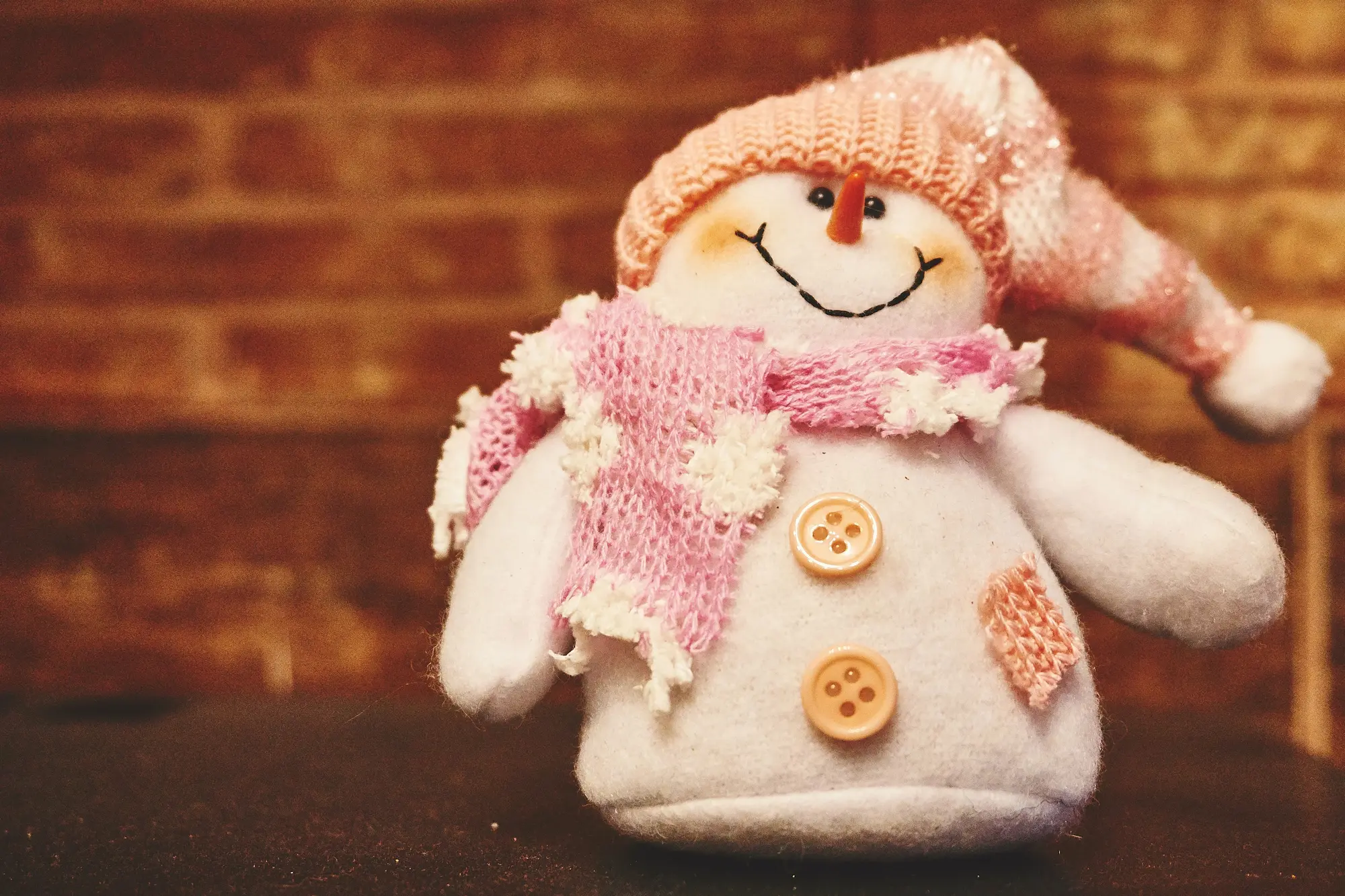
snowman
Example Usage

An image with aspect ratio and object position set at the xs and md breakpoints.Uses the theme's default border radius.

Example Props:
{
  "image": "snowman",
  "imageAlt": "snowman",
  "imageBorderRadius": "default",
  "aspectRatio": {
    "xs": "3/2",
    "md": "16/9"
  },
  "objectPosition": {
    "xs": "center",
    "md": "top"
  },
  "paddingBlockStart": "",
  "paddingBlockEnd": ""
}
Props

Pass these props to control the content and settings.

  • image [string] | required
    The filename of the image without the extension. (e.g. snowman)
  • imageAlt [string]
    Alternative text for the image, used for accessibility. (e.g. Stuffed snowman)
  • imageBorderRadius [string] | default: default
    Specifies the border radius for the image. Uses our border-radius units or the --br-default property. (e.g. 3, 4, default)
  • aspectRatio [object]
    An object defining the aspect ratio for the image at different breakpoints. Think mobile first. Set the xs value and then any other breakpoints that change it.
    Object Props:
    • xs [string] | default: 3/2
      Aspect ratio for extra small screen sizes. (e.g. 3/2)
    • sm [string]
      Aspect ratio for small screen sizes.
    • md [string]
      Aspect ratio for medium screen sizes.
    • lg [string]
      Aspect ratio for large screen sizes.
    • xl [string]
      Aspect ratio for extra-large screen sizes.
  • objectPosition [object]
    An object specifying the objectPosition css property for the image. Controls what gets cropped off. Think mobile first. Set the xs value and then any other breakpoints that change it.
    Object Props:
    • xs [string] | default: center
      Object position for extra small screen sizes. (e.g. top left)
    • sm [string]
      Object position for small screen sizes.
    • md [string]
      Object position for medium screen sizes.
    • lg [string]
      Object position for large screen sizes.
    • xl [string]
      Object position for extra-large screen sizes.
  • paddingBlockStart [string] | default: 0
    Padding applied to the top of the image container, using spacing units. (e.g. 5)
  • paddingBlockEnd [string] | default: 0
    Padding applied to the bottom of the image container, using spacing units. (e.g. 5)

Menu 1

Path: ntgt-patterns/menu-1/menu-1.liquid

A multi-level navigation menu with customizable styles and a modal-based structure. Supports up to three levels of navigation with collapsible submenus. Meant to be a mobile-menu, opened by a button that is hidden on desktop.

This pattern is a modal.

Example 1

A basic three-level navigation menu using default settings.

Example Props:
{
  "modalId": "menu-1-example-1",
  "navLinks": [
    {
      "text": "Level 1 Submenu (3-Levels)",
      "submenu": [
        {
          "text": "Level 2 Submenu",
          "submenu": [
            {
              "text": "Level 3 Link 1",
              "link": "/some-page/"
            },
            {
              "text": "Level 3 Link 2",
              "link": "/some-page/"
            },
            {
              "text": "Level 3 Link 3",
              "link": "/some-page/"
            }
          ]
        },
        {
          "text": "Level 2 Link",
          "link": "/some-page/"
        }
      ]
    },
    {
      "text": "Level 1 Submenu (2-Levels)",
      "submenu": [
        {
          "text": "Level 2 Link 1",
          "link": "/some-page/"
        },
        {
          "text": "Level 2 Link 2",
          "link": "/some-page/"
        },
        {
          "text": "Level 2 Link 3",
          "link": "/some-page/"
        }
      ]
    },
    {
      "text": "Level 1 Link",
      "link": "/other-page/"
    }
  ]
}

This pattern is a modal.

Example 2

This example shows all the props that can be customized, but currently set to their default values.

Example Props:
{
  "modalId": "menu-1-example-2",
  "colorContext": "neutral-light",
  "paddingBlock": "4",
  "paddingInline": "5",
  "submenuColorContext": "neutral-shaded",
  "submenuIcon": {
    "name": "arrow-down-1",
    "size": "1",
    "transitionClass": "toggle-rotate-180",
    "otherClasses": "shift-be-5"
  },
  "level1Style": {
    "textColor": "normal",
    "fontFamily": "body",
    "fontWeight": "700",
    "textTransform": "none",
    "fontSize": "default",
    "fontStyle": "normal",
    "borderColor": "xxsubdued",
    "borderWidth": "default",
    "paddingBlock": "4"
  },
  "level2Style": {
    "textColor": "normal",
    "fontFamily": "body",
    "fontWeight": "700",
    "textTransform": "none",
    "fontSize": "default",
    "fontStyle": "normal",
    "borderColor": "xxsubdued",
    "borderWidth": "default",
    "paddingBlock": "4"
  },
  "level3Style": {
    "textColor": "normal",
    "fontFamily": "body",
    "fontWeight": "400",
    "textTransform": "none",
    "fontSize": "default",
    "fontStyle": "normal",
    "borderColor": "xxsubdued",
    "borderWidth": "default",
    "paddingBlock": "4"
  },
  "navLinks": [
    {
      "text": "Level 1 Submenu (3-Levels)",
      "submenu": [
        {
          "text": "Level 2 Submenu",
          "submenu": [
            {
              "text": "Level 3 Link 1",
              "link": "/some-page/"
            },
            {
              "text": "Level 3 Link 2",
              "link": "/some-page/"
            },
            {
              "text": "Level 3 Link 3",
              "link": "/some-page/"
            }
          ]
        },
        {
          "text": "Level 2 Link",
          "link": "/some-page/"
        }
      ]
    },
    {
      "text": "Level 1 Submenu (2-Levels)",
      "submenu": [
        {
          "text": "Level 2 Link 1",
          "link": "/some-page/"
        },
        {
          "text": "Level 2 Link 2",
          "link": "/some-page/"
        },
        {
          "text": "Level 2 Link 3",
          "link": "/some-page/"
        }
      ]
    },
    {
      "text": "Level 1 Link",
      "link": "/other-page/"
    }
  ]
}
Props

Pass these props to control the content and settings.

  • modalId [string] | required
    The unique ID for the modal that wraps the menu. Used by buttons to target the modal.
  • colorContext [string] | default: neutral-light
    Color theme applied to the menu container, including level 1 items. (e.g., 'neutral-light', 'neutral-shaded')
  • paddingBlock [string] | default: 4
    Vertical padding applied to the menu items. Uses spacing units. Can be overridden per level. (e.g., '4', '5')
  • paddingInline [string] | default: 5
    Horizontal padding applied to the menu items. Uses spacing units. Can be overridden per level. (e.g., '4', '5')
  • submenuColorContext [string] | default: neutral-shaded
    Color theme applied to level 2 and level 3 submenu containers. (e.g., 'neutral-shaded', 'neutral-light')
  • submenuIcon [object]
    Icon settings for submenu toggles.
    Object Props:
    • name [string] | default: arrow-down-1
      Name of the icon used for submenu toggles.
    • size [string] | default: 1
      Size of the submenu icon. Uses icon size units. (e.g., '1', '2')
    • transitionClass [string] | default: toggle-rotate-180
      CSS class for the transition effect of the submenu icon. (e.g., 'toggle-rotate-180', 'toggle-rotate-90')
    • otherClasses [string] | default: shift-be-5
      Additional CSS classes for the submenu icon. Useful for shifting the icon relative to the text. (e.g., 'shift-be-5', 'shift-bs-5')
  • level1Style [object]
    Styling options for level 1 menu items.
    Object Props:
    • textColor [string] | default: normal
      Text color for level 1 items. (e.g., 'normal', 'subdued', 'xsubdued', 'vibrant')
    • fontFamily [string] | default: body
      Font family for level 1 items. (e.g., 'body', 'heading')
    • fontWeight [string] | default: 700
      Font weight for level 1 items. (e.g., '400', '700')
    • textTransform [string] | default: none
      Text transformation for level 1 items. (e.g., 'none', 'uppercase')
    • fontSize [string] | default: default
      Font size for level 1 items. (e.g., 'default', '3', '4')
    • fontStyle [string] | default: normal
      Font style for level 1 items. (e.g., 'normal', 'italic')
    • borderColor [string] | default: xxsubdued
      Border color for level 1 items. (e.g., 'xxsubdued', 'xsubdued', 'subdued')
    • borderWidth [string] | default: default
      Border width for level 1 items. (e.g., 'default', '1', '2')
    • paddingBlock [string] | default: 4
      Vertical padding for level 1 items. Overrides global paddingBlock if set.
  • level2Style [object]
    Styling options for level 2 menu items.
    Object Props:
    • textColor [string] | default: normal
      Text color for level 2 items. (e.g., 'normal', 'subdued', 'xsubdued')
    • fontFamily [string] | default: body
      Font family for level 2 items. (e.g., 'body', 'heading')
    • fontWeight [string] | default: 700
      Font weight for level 2 items. (e.g., '400', '700')
    • textTransform [string] | default: none
      Text transformation for level 2 items. (e.g., 'none', 'uppercase')
    • fontSize [string] | default: default
      Font size for level 2 items. (e.g., 'default', '3', '4')
    • fontStyle [string] | default: normal
      Font style for level 2 items. (e.g., 'normal', 'italic')
    • borderColor [string] | default: xxsubdued
      Border color for level 2 items. (e.g., 'xxsubdued', 'xsubdued', 'subdued')
    • borderWidth [string] | default: default
      Border width for level 2 items. (e.g., 'default', '1', '2')
    • paddingBlock [string] | default: 4
      Vertical padding for level 2 items. Overrides global paddingBlock if set.
  • level3Style [object]
    Styling options for level 3 menu items.
    Object Props:
    • textColor [string] | default: normal
      Text color for level 3 items. (e.g., 'normal', 'subdued', 'xsubdued')
    • fontFamily [string] | default: body
      Font family for level 3 items. (e.g., 'body', 'heading')
    • fontWeight [string] | default: 400
      Font weight for level 3 items. (e.g., '400', '700')
    • textTransform [string] | default: none
      Text transformation for level 3 items. (e.g., 'none', 'uppercase')
    • fontSize [string] | default: default
      Font size for level 3 items. (e.g., 'default', '3', '4')
    • fontStyle [string] | default: normal
      Font style for level 3 items. (e.g., 'normal', 'italic')
    • borderColor [string] | default: xxsubdued
      Border color for level 3 items. (e.g., 'xxsubdued', 'xsubdued', 'subdued')
    • borderWidth [string] | default: default
      Border width for level 3 items. (e.g., 'default', '1', '2')
    • paddingBlock [string] | default: 4
      Vertical padding for level 3 items. Overrides global paddingBlock if set.
  • navLinks [array]
    An array of navigation link (or submenu button) objects for the menu structure.
    navLink [object]
    Object Props:
    • text [string] | required
      Text displayed for the navigation link/button.
    • link [string]
      URL or path the link navigates to. Leave this off if this item is a submenu button.
    • submenu [array]
      Array of level 2 submenu items. Leave this off if the item is a link.
      submenuItem [object]
      Object Props:
      • text [string] | required
        Text displayed for the submenu item.
      • link [string]
        URL or path the submenu item navigates to. Leave this off if the item is a submenu button.
      • submenu [array]
        Array of level 3 submenu items. Leave this off if the item is a link. These items must be links, not submenu buttons.

Overlay 1

Path: ntgt-patterns/overlay-1/overlay-1.liquid

A large image and/or video with content overlayed on top. We define aspect ratios for each breakpoint. We also set a wide and tall image/video. If both image and video are set, the image will We define what percentage of the box the image/video's subject takes up. The remainder of the box is where the text content goes. We define a max-width for the content box. For xs and sm, the content will either be at the top or bottom of the box. On md and up, the content will be on the left, right, or in the center. For center positioning, the subject will be the amount of the box on either side that should be reserved for the subject. The content will be centered in the remaining space. We can also set the text alignment to left or center on xs and on md. The heading can be a simple string or HTML, allowing us to do fancy things with spans of text. If it's a simple string, we can set the heading tag and size class. We can also set one or more buttons. We can set the size of all buttons to small or normal. Each button can be primary, secondary, or tertiary prominence. Each button has a target and an behavior (link, new tab, or modal).

Overlay Content — Heading Here

Lorem ipsum dolor sit amet, consectetur adipiscing elit. Etiam odio lectus, condimentum sit amet luctus sed, consequat et tortor. Etiam non tortor eu nunc euismod aliquet vitae a odio.
yawning dog
yawning dog
Example 1

Example with an image and a video. The subject is on the left on md and up. The content is centered vertically on md and up. It uses heading HTML and two buttons.

Example Props:
{
  "imageWide": {
    "name": "yawning-dog-video-overlay_wide",
    "alt": "yawning dog"
  },
  "imageTall": {
    "name": "yawning-dog-video-overlay_tall",
    "alt": "yawning dog"
  },
  "videoWide": {
    "video": "/assets/videos/video_space-woman-wide_1920.mp4",
    "posterImage": "video_space-woman-wide",
    "objectPosition": "bottom left"
  },
  "videoTall": {
    "video": "/assets/videos/video_space-woman-tall_600.mp4",
    "posterImage": "video_space-woman-tall",
    "objectPosition": "bottom left"
  },
  "heading": {
    "text": "Basic Heading Text",
    "tag": "h2",
    "class": "h2"
  },
  "headingHtml": "<h2 class=\"h2\"><span class=\"block\" style=\"text-transform: uppercase;\">Overlay Content</span><span class=\"block\" style=\"font-style: italic; font-weight: 400;\">— Heading Here</span>/h2>",
  "contentRichText": "Lorem ipsum dolor sit amet, consectetur adipiscing elit. Etiam odio lectus, condimentum sit amet luctus sed, consequat et tortor. Etiam non tortor eu nunc euismod aliquet vitae a odio.",
  "buttons": [
    {
      "text": "Open Modal",
      "target": "#some-modal-id",
      "behavior": "modal",
      "prominence": "primary"
    },
    {
      "text": "Link to Page",
      "target": "/some/page/",
      "behavior": "link",
      "prominence": "secondary"
    }
  ],
  "buttonSize": "small",
  "contentColorContext": "neutral-dark",
  "contentSubjectFlexDirectionMd": "row",
  "contentMaxWidth": "max(28rem, 30vw)",
  "contentInlinePositionMd": "end",
  "contentBlockPosition": {
    "xs": "start",
    "md": "center"
  },
  "contentRichTextAlignment": {
    "xs": "start",
    "md": "start"
  },
  "imageSubjectSize": {
    "xs": "51%",
    "sm": "60%",
    "md": "43%",
    "lg": "41%",
    "xl": "41%"
  },
  "blockAspectRatio": {
    "xs": "1/2",
    "sm": "1/1.5",
    "md": "16/9",
    "lg": "2/1",
    "xl": "2.3/1"
  }
}

Make Every Flush a Celebration

At Fiesta Flush, we make the finest toilets in the world. Our toilets are so good, you'll want to throw a party every time you flush.

  • Superior Quality: Our toilets are made from the finest materials and are built to last.
  • Eco-Friendly: Our toilets are designed to be eco-friendly and are made from recycled materials.
toilet with sombrero
Example 2

Example with an only an image. The subject is on the right on md and up. The color scheme works for a light photo. It also makes more use of defaults.

Example Props:
{
  "imageWide": {
    "name": "sombrero-toilet-light-wide",
    "alt": "toilet with sombrero",
    "objectPosition": "bottom right"
  },
  "imageTall": {
    "name": "sombrero-toilet-light-tall",
    "alt": "toilet with sombrero",
    "objectPosition": "bottom right"
  },
  "heading": {
    "text": "Make Every Flush a Celebration",
    "tag": "h2",
    "class": "h1"
  },
  "contentRichText": "<p>At Fiesta Flush, we make the finest toilets in the world. Our toilets are so good, you'll want to throw a party every time you&nbsp;flush.</p><ul><li><b>Superior Quality:</b> Our toilets are made from the finest materials and are built to last.</li><li><b>Eco-Friendly:</b> Our toilets are designed to be eco-friendly and are made from recycled materials.</li></ul>",
  "buttons": [
    {
      "text": "Order Now",
      "target": "/some/page/",
      "behavior": "link",
      "prominence": "secondary"
    }
  ],
  "buttonSize": "medium",
  "contentColorContext": "accent1-shaded",
  "contentBlockPosition": {
    "xs": "start",
    "md": "center"
  },
  "contentRichTextAlignment": {
    "xs": "start",
    "md": "start"
  },
  "imageSubjectSize": {
    "xs": "50%",
    "sm": "60%",
    "md": "40%",
    "lg": "40%",
    "xl": "40%"
  },
  "blockAspectRatio": {
    "xs": "1/2",
    "sm": "1/1.5",
    "md": "16/9",
    "lg": "2/1",
    "xl": "2.3/1"
  }
}

A Lone Rock in the Water

Lorem ipsum dolor sit amet, consectetur adipiscing elit. Etiam odio lectus, condimentum sit amet luctus sed, consequat et tortor. Etiam non tortor eu nunc euismod aliquet vitae a odio.
lone rock in the water
Example 3

Example with an only an image. The subject is at the bottom, allowing for centered content above. The color scheme works for a light photo.

Example Props:
{
  "imageWide": {
    "name": "lone-rock-water-wide",
    "alt": "lone rock in the water",
    "objectPosition": "bottom center"
  },
  "imageTall": {
    "name": "lone-rock-water-tall",
    "alt": "lone rock in the water",
    "objectPosition": "bottom left"
  },
  "heading": {
    "text": "A Lone Rock in the Water",
    "tag": "h2",
    "class": "h2"
  },
  "contentRichText": "Lorem ipsum dolor sit amet, consectetur adipiscing elit. Etiam odio lectus, condimentum sit amet luctus sed, consequat et tortor. Etiam non tortor eu nunc euismod aliquet vitae a odio.",
  "buttons": [
    {
      "text": "Learn More",
      "target": "/some/page/",
      "behavior": "link",
      "prominence": "primary"
    }
  ],
  "buttonSize": "medium",
  "contentColorContext": "neutral-shaded-2",
  "contentSubjectFlexDirectionMd": "column",
  "contentInlinePositionMd": "start",
  "contentBlockPosition": {
    "xs": "start",
    "md": "center"
  },
  "contentRichTextAlignment": {
    "xs": "center",
    "md": "center"
  },
  "imageSubjectSize": {
    "xs": "35%",
    "sm": "40%",
    "md": "30%",
    "lg": "30%",
    "xl": "30%"
  },
  "blockAspectRatio": {
    "xs": "1/2",
    "sm": "1/1.5",
    "md": "16/9",
    "lg": "2/1",
    "xl": "2.3/1"
  }
}
Props

Pass these props to control the content and settings.

  • imageWide [object]
    An object of settings for the wide image. The wide image will show on md and up.
    Object Props:
    • name [string] | required
      the image filename without path or extension.
    • alt [string]
      The alt text, used for accessibility.
    • objectPosition [string] | default: bottom left
      The object-position value. When cropping occurs, this part of the image will be prioritized.
  • imageTall [object]
    An object of settings for the tall image. The tall image will show on sm and down.
    Object Props:
    • name [string] | required
      the image filename without path or extension.
    • alt [string]
      The alt text, used for accessibility.
    • objectPosition [string] | default: bottom left
      The object-position value. When cropping occurs, this part of the image will be prioritized.
  • videoWide [object]
    An object of settings for the wide video. The wide image will show on md and up. If both images and videos are set, the image will show on top of the video.
    Object Props:
    • video [string] | required
      The path to the video file. e.g. /assets/videos/video-wide.mp4
    • posterImage [string] | required
      The name of the video poster image without path or extension. This shows when the video is not playing.
    • objectPosition [string] | default: bottom left
      The object-position value. When cropping occurs, this part of the image will be prioritized.
  • videoTall [object]
    An object of settings for the tall video. The tall image will show on md and up. If both images and videos are set, the image will show on top of the video.
    Object Props:
    • video [string] | required
      The path to the video file. e.g. /assets/videos/video-tall.mp4
    • posterImage [string] | required
      The name of the video poster image without path or extension. This shows when the video is not playing.
    • objectPosition [string] | default: bottom left
      The object-position value. When cropping occurs, this part of the image will be prioritized.
  • heading [object]
    An object of settings for a basic heading.
    Object Props:
    • text [string] | required
      The text to be inserted in the heading tag. May contain simple HTML, like breaks or spans.
    • tag [string] | default: h2
      The html tag to use for the heading. e.g. h1, h2, h3, h4, div
    • class [string] | default: h2
      This class will be added to the heading tag to set it's class for size/font. e.g. h1, h2, h3, h4
  • headingHtml [string]
    This HTML will be inserted instead of the heading tag. This allows for all kinds of fancy formatting. If this is set, headingText, headingTag, and headingClass will be ignored.
  • contentRichText [string]
    The rich text content. Supports HTML tags like p, ul, ol, li, br, em, strong, a etc.
  • buttons [array]
    An array of button objects representing the content buttons.
    button [object]
    Object Props:
    • text [string] | required
      The text of the button.
    • target [string] | required
      The value of href or data-open-modal for the button/link. e.g. /some/page/, #some-modal
    • behavior [string] | required | default: link
      The behavior of the button. e.g. link, new-tab, modal
    • prominence [string] | default: primary
      The prominence of the button. e.g. primary, secondary, tertiary
  • buttonSize [string] | default: medium
    The size of the buttons. e.g. small, medium
  • contentColorContext [string] | default: neutral-dark
    The color context that will determine the colors of content elements. e.g. neutral-dark (for dark photos), neutral-shaded-2 (for light photos)
  • contentMaxWidth [string] | default: max(28rem, 30vw)
    The value of the max-inline-size property for the content box.
  • contentSubjectFlexDirectionMd [string] | default: row
    On md and up, are the content and image subject in a row or column relative to each other. e.g. row, column
  • contentInlinePositionMd [string] | default: end
    The horizontal position of the content on md and up. e.g. start, center, end.
  • contentBlockPosition [object]
    An object that sets the vertical position of the content at different breakpoints.
    Object Props:
    • xs [string] | default: center
      The vertical position of the content on xs and sm. e.g. start, center, end
    • md [string] | default: center
      The vertical position of the content on md and up. e.g. start, center, end
  • contentRichTextAlignment [object]
    An object that sets the text alignment of the content at different breakpoints.
    Object Props:
    • xs [string] | default: start
      The text alignment of the content on xs and sm. e.g. start, center
    • md [string] | default: start
      The text alignment of the content on md and up. e.g. start, center, end
  • imageSubjectSize [object]
    An object that sets the percentage of the box that should be reserved to show the image/video's subject at different breakpoints.
    Object Props:
    • xs [string] | default: 50%
      The image subject size on xs. e.g. 50%
    • sm [string] | default: 60%
      The image subject size on sm. e.g. 60%
    • md [string] | default: 40%
      The image subject size on md. e.g. 40%
    • lg [string] | default: 40%
      The image subject size on lg. e.g. 40%
    • xl [string] | default: 40%
      The image subject size on xl. e.g. 40%
  • blockAspectRatio [object]
    An object that sets the aspect ratio of the block, video, and image at different breakpoints.
    Object Props:
    • xs [string] | default: 1/2
      The block aspect ratio xs. e.g. 1/2
    • sm [string] | default: 1/1.5
      The block aspect ratio sm. e.g. 1/1.5
    • md [string] | default: 16/9
      The block aspect ratio md. e.g. 16/9
    • lg [string] | default: 2/1
      The block aspect ratio lg. e.g. 2/1
    • xl [string] | default: 2.3/1
      The block aspect ratio xl. e.g. 2.3/1

Overlay 2

Path: ntgt-patterns/overlay-2/overlay-2.liquid

An overlay pattern used for a page hero. The heading should be short and will be centered in a square on larger screens. On smaller screens it will cover the whole image.

Services

corn cob
Default Overlay Example

The expected use case for this pattern.

Example Props:
{
  "colorContext": "neutral-light",
  "overlayColorContext": "accent1-dark",
  "overlayOpacity": "80",
  "heading": {
    "tag": "h1",
    "class": "h1",
    "fontSizeSm": "9",
    "text": "Services"
  },
  "aspectRatio": {
    "xs": "3/2",
    "md": "3/1"
  },
  "paddingBlockStart": "6",
  "paddingBlockEnd": "6",
  "image": "corn-cob",
  "imageAlt": "corn cob",
  "imageBorderRadius": "4",
  "imageObjectPosition": {
    "xs": "center",
    "md": "center"
  }
}
Props

Pass these props to control the content and settings.

  • colorContext [string] | default: neutral-light
    The color context for the main container, including space outside the image. (e.g. 'neutral-light', 'neutral-dark')
  • overlayColorContext [string] | default: accent1-dark
    The color context for the overlay. Sets the background and text color. (e.g. 'accent1-dark', 'neutral-light')
  • overlayOpacity [string] | default: 80
    Opacity level for the overlay background. Applies background opacity classes which are based on percentage values. (e.g., '70', '80', '90')
  • heading [object]
    Settings for the overlay heading, including text content, HTML tag, and CSS class.
    Object Props:
    • tag [string] | default: h1
      HTML tag for the heading, e.g., 'h1', 'h2'.
    • class [string] | default: h1
      CSS class for the heading, setting the style (e.g., 'h1', 'h2').
    • fontSizeSm [string] | default: 9
      Font size for the heading on screens of the sm beakpoint and up. On xs, the default size for the heading class chosen will apply. Uses our font size units. (e.g., 9, 10, 11).
    • text [string] | required
      Text content for the heading. If this is blank or ommitted the heading will not display.
  • aspectRatio [object]
    Set the aspect ratios for the image at breakpoints.
    Object Props:
    • xs [string] | default: 3/2
      Aspect ratio for xs screens, e.g., '3/2'.
    • md [string] | default: 3/1
      Aspect ratio for md screens and up, e.g., '3/1'.
  • paddingBlockStart [string] | default: 6
    Top padding above the image in spacing units, (e.g., '0', '6', '7').
  • paddingBlockEnd [string] | default: 6
    Bottom padding below the image in spacing units, (e.g., '0', '6', '7').
  • image [string] | default: corn-cob
    Filename for the background image without path or extension.
  • imageAlt [string] | default: corn cob
    Alternative text for the background image, used for accessibility.
  • imageBorderRadius [string] | default: default
    Border radius for the image. Uses our border radius units. (e.g., 'default', '1', '2', '3', '4').
  • imageObjectPosition [object]
    Positioning of the background image, controlling its focus area at different breakpoints.
    Object Props:
    • xs [string] | default: center
      Object position for the image on extra small screens, e.g., 'center', 'bottom left'.
    • md [string] | default: center
      Object position for the image on medium screens, e.g., 'center', 'bottom left'.

Set 1

Path: ntgt-patterns/set-1/set-1.liquid

A set of images with corresponding content (heading and text). There is ample spacing around elements.

Rolls

Professional & Caring Staff

Our compassionate team ensures that every pet receives gentle, professional care tailored to their needs.

a stack of $100 bills

Convenient Mobile Service

Enjoy stress-free grooming at your convenience with our state-of-the-art mobile grooming vans that come to you.

Example 1

Example of set-1 with two items.

Example Props:
{
  "colorContext": "neutral-light",
  "blockSpacing": {
    "xs": "7",
    "lg": "8"
  },
  "itemGridGap": {
    "row": "6",
    "column": "6"
  },
  "itemContentInlineIndent": {
    "xs": "5",
    "sm": "6",
    "md": "6",
    "lg": "4",
    "xl": "6"
  },
  "itemImageBorderRadius": "4",
  "itemImageAspectRatio": {
    "xs": "3/2",
    "sm": "3/2",
    "md": "3/2",
    "lg": "3/2",
    "xl": "3/2"
  },
  "itemHeading": {
    "tag": "h2",
    "class": "h2",
    "color": "normal"
  },
  "itemContentBlockSpacing": "3",
  "items": [
    {
      "image": "rolls",
      "imageAlt": "Rolls",
      "headingHtml": "Professional &&nbsp;Caring&nbsp;Staff",
      "contentHtml": "Our <a href='#'>compassionate team</a> ensures that every pet receives gentle, professional care tailored to their needs."
    },
    {
      "image": "benjamins",
      "imageAlt": "a stack of $100 bills",
      "headingHtml": "Convenient Mobile Service",
      "contentHtml": "Enjoy stress-free grooming at your convenience with our state-of-the-art <a href='#'>mobile grooming vans</a> that come to you."
    }
  ]
}
Props

Pass these props to control the content and settings.

  • colorContext [string] | default: neutral-light
    The color context applied to the set container. It defines the background and text colors. (e.g. 'neutral-light', 'neutral-shaded')
  • blockSpacing [object]
    Object defining the block (vertical) padding and row-gap between items at the xs and lg breakpoints.
    Object Props:
    • xs [string] | default: 7
      Spacing at the extra small screen size. Uses spacing units. (e.g. 7, 8).
    • lg [string] | default: 8
      Spacing at the large screen size. Uses spacing units. (e.g. 7, 8).
  • itemGridGap [object]
    Defines the gap between the image and content.
    Object Props:
    • row [string] | default: 6
      Row gap affects vertical space on smaller screens. Uses spacing units. (e.g. 5, 6)
    • column [string] | default: 6
      Column gap affects horisontal space on larger screens. Uses spacing units. (e.g. 5, 6)
  • itemContentInlineIndent [object]
    The content (heading and text) are indented more on the inline (horizontal) axis to give the design more whitespace. This amount can be adjusted ate each breakpoint to help manage text wrapping. Uses spacing units. (e.g. 5, 6)
    Object Props:
    • xs [string] | default: 5
      Indentation at the extra small screen size.
    • sm [string] | default: 6
      Indentation at the small screen size.
    • md [string] | default: 6
      Indentation at the medium screen size.
    • lg [string] | default: 4
      Indentation at the large screen size.
    • xl [string] | default: 6
      Indentation at the extra large screen size.
  • itemImageBorderRadius [string] | default: 4
    Border radius applied to images within each item. Uses border-radius units. (e.g. 3, 4, 5)
  • itemImageAspectRatio [object]
    Object defining the aspect ratio for images at different breakpoints.
    Object Props:
    • xs [string] | default: 3/2
      Aspect ratio for extra small screen size.
    • sm [string] | default: 3/2
      Aspect ratio for small screen size.
    • md [string] | default: 3/2
      Aspect ratio for medium screen size.
    • lg [string] | default: 3/2
      Aspect ratio for large screen size.
    • xl [string] | default: 3/2
      Aspect ratio for extra large screen size.
  • itemHeading [object]
    Object containing settings for the heading of each item.
    Object Props:
    • tag [string] | default: h2
      The HTML tag to be used for the heading. (e.g. h2, h3)
    • class [string] | default: h2
      CSS class applied to the heading. Applies h2 or h3 styling. (e.g. h2, h3)
    • color [string] | default: normal
      The color of the heading (e.g. normal, vibrant).
  • itemContentBlockSpacing [string] | default: 3
    Block (vertical) spacing between the heading and text of each item. Uses spacing units. (e.g. 3, 4)
  • items [array] | required
    Array of items displayed in the set. Each item contains content and image details.
    item [object]
    Object Props:
    • image [string] | required
      The name of the image file without the file extension. (e.g. rolls)
    • imageAlt [string]
      Alternative text for the image for accessibility. (e.g. fresh baked roles
    • headingHtml [string] | required
      HTML content for the heading of the item. Mostly just text, but supports non-breaking space entities to control wrapping. (e.g. 'Professional & Caring Staff')
    • contentHtml [string] | required
      HTML content for the item's description or main text. Mostly just text, but supports links. (e.g. Some text and a link)

Set 2

Path: ntgt-patterns/set-2/set-2.liquid

A grid of items, each with an icon, heading, and text. Useful as a child block of grid-2. The grid uses auto-columns, so depending on the container width, it may a 2-column grid or more.You should try to have a number of items divisible by the number of columns.

Temp-Controlled Environment

Ensures your pet is comfortable throughout the grooming process.

Heated Water System

Provides a soothing and warm bath experience.

Advanced Grooming Tools

State-of-the-art equipment for precise and gentle grooming.

Sanitization

Staff thoroughly cleans and sanitizes vans between appointments.

Example 1

This example shows all the props in use. Many can be omitted, and defaults will be used.

Example Props:
{
  "paddingBlockStart": "0",
  "paddingBlockEnd": "0",
  "border": {
    "radius": "7",
    "width": "2",
    "color": "vibrant"
  },
  "icon": {
    "size": "3",
    "color": "vibrant"
  },
  "headingColor": "vibrant",
  "gridGap": "6",
  "minInlineSize": "19rem",
  "items": [
    {
      "icon": "bird-house",
      "heading": "Temp-Controlled Environment",
      "text": "Ensures your pet is comfortable throughout the grooming process."
    },
    {
      "icon": "calendar",
      "heading": "Heated Water System",
      "text": "Provides a soothing and warm bath experience."
    },
    {
      "icon": "cog",
      "heading": "Advanced Grooming Tools",
      "text": "State-of-the-art equipment for precise and gentle grooming."
    },
    {
      "icon": "alarm-clock",
      "heading": "Sanitization",
      "text": "Staff thoroughly cleans and sanitizes vans between appointments."
    }
  ]
}
Props

Pass these props to control the content and settings.

  • paddingBlockStart [string] | default: 0
    Add space above the grid of items. Uses spacing units (e.g., '0', '5').
  • paddingBlockEnd [string] | default: 0
    Add space below the grid of items. Uses spacing units (e.g., '0', '5').
  • border [object]
    An object defining the border properties for each item in the grid.
    Object Props:
    • radius [string] | default: 7
      The border-radius of each item, using border-radius units (e.g., '7').
    • width [string] | default: 2
      The border-width of each item, using line-width units (e.g., 1, 2, 3).
    • color [string] | default: vibrant
      The color of the border. (e.g. vibrant, normal, subdued, xsubdued)
  • icon [object]
    An object defining the icon properties for each item.
    Object Props:
    • size [string] | default: 3
      Size of the icon (e.g. 3, 4).
    • color [string] | default: vibrant
      Color of the icon. (e.g. vibrant, normal, subdued, xsubdued)
  • headingColor [string] | default: vibrant
    The color of the item heading text. (e.g. vibrant, normal, subdued, xsubdued)
  • gridGap [string] | default: 6
    The gap between grid items, defined in spacing units (e.g. 5, 6, 7).
  • minInlineSize [string] | default: 19rem
    The minimum inline-size of each item. May need to be adjusted a bit depending on the container width and the gridGap.
  • items [array] | required
    An array of items to display in the grid. Each item contains properties for an icon, heading, and text.
    item [object]
    Object Props:
    • icon [string] | required
      The icon identifier or name (e.g., 'bird-house', 'calendar').
    • heading [string] | required
      The heading text for the item (e.g., 'Temp-Controlled Environment').
    • text [string] | required
      The description or additional text for the item (e.g., 'Ensures your pet is comfortable throughout the grooming process.').

Set 3

Path: ntgt-patterns/set-3/set-3.liquid

A set of text items that can be expanded to show additional text. Useful for FAQs. Uses details/summary elements for good semantic HTML. The image only shows on md and up. The button can be used to link to a page of more faq's or open a modal.

rolls

Frequently Asked Questions

What types of pets do you groom?

Lorem ipsum dolor sit amet, consectetur adipiscing elit. Etiam odio lectus, condimentum sit amet luctus sed, consequat et tortor. Etiam non tortor eu nunc euismod aliquet vitae a odio.

How long does a grooming session take?

Lorem ipsum dolor sit amet, consectetur adipiscing elit. Etiam odio lectus, condimentum sit amet luctus sed, consequat et tortor. Etiam non tortor eu nunc euismod aliquet vitae a odio.

Do I need to be home during the grooming?

Lorem ipsum dolor sit amet, consectetur adipiscing elit. Etiam odio lectus, condimentum sit amet luctus sed, consequat et tortor. Etiam non tortor eu nunc euismod aliquet vitae a odio.

Example 1

A set of faqs.

Example Props:
{
  "colorContext": "accent1-shaded",
  "heading": {
    "text": "Frequently Asked Questions",
    "tag": "h3",
    "class": "h3",
    "color": "vibrant"
  },
  "items": [
    {
      "summary": "What types of pets do you groom?",
      "details": "Lorem ipsum dolor sit amet, consectetur adipiscing elit. Etiam odio lectus, condimentum sit amet luctus sed, consequat et tortor. Etiam non tortor eu nunc euismod aliquet vitae a odio."
    },
    {
      "summary": "How long does a grooming session take?",
      "details": "Lorem ipsum dolor sit amet, consectetur adipiscing elit. Etiam odio lectus, condimentum sit amet luctus sed, consequat et tortor. Etiam non tortor eu nunc euismod aliquet vitae a odio."
    },
    {
      "summary": "Do I need to be home during the grooming?",
      "details": "Lorem ipsum dolor sit amet, consectetur adipiscing elit. Etiam odio lectus, condimentum sit amet luctus sed, consequat et tortor. Etiam non tortor eu nunc euismod aliquet vitae a odio."
    }
  ],
  "button": {
    "text": "View FAQ",
    "target": "/faq/",
    "behavior": "link",
    "prominence": "secondary",
    "size": "small"
  },
  "image": {
    "name": "rolls",
    "alt": "rolls",
    "borderRadius": "4"
  },
  "imageAspectRatio": {
    "md": "3/2"
  },
  "itemSettings": {
    "color": "normal",
    "fontWeight": "700",
    "fontSize": "default",
    "marginBlockStart": "4",
    "gap": "4"
  },
  "paddingBlock": {
    "xs": "7"
  }
}
Props

Pass these props to control the content and settings.

  • colorContext [string] | default: accent1-shaded
    Defines the background and text colors for the block. (e.g. 'neutral-shaded', 'accent1-shaded')
  • heading [object]
    Defines the heading properties.
    Object Props:
    • text [string]
      The heading text content. If not provided, the heading will not be displayed.
    • tag [string] | default: h3
      The HTML tag for the heading (e.g. h3, h4).
    • class [string] | default: h3
      CSS class applied to the heading for styling (e.g. 'h3', 'h4').
    • color [string] | default: vibrant
      The text color of the heading (e.g. 'vibrant', 'normal').
  • items [array] | required
    Array of items, each with a heading and content.
    item [object]
    Object Props:
    • heading [string] | required
      The heading text you click to expand the content.
    • content [string] | required
      The revealed content.
  • button [object]
    Defines properties for the optional button. The text and target must be set to show the button.
    Object Props:
    • text [string] | required
      The button text.
    • target [string] | required
      The button link or modal target.
    • behavior [string] | default: link
      The behavior of the button (e.g. 'link', 'new-tab', 'modal').
    • size [string] | default: small
      The size of the button (e.g. 'small', 'medium', 'large').
    • prominence [string] | default: secondary
      The visual prominence of the button (e.g. 'primary', 'secondary').
  • image [object]
    Defines the image settings.
    Object Props:
    • name [string] | required
      The image file name without extension.
    • alt [string]
      Alternative text for the image, used for accessibility.
    • borderRadius [string] | default: 4
      The border radius of the image, in border-radius units.
  • imageAspectRatio [object]
    Defines the aspect ratios for the image at different breakpoints. The image is hidden on xs and sm so don't set those. Think mobile first. Set a value for md, then add values for lg and xl if you need to change it.
    Object Props:
    • md [string] | default: 3/2
      Aspect ratio for medium breakpoints.
    • lg [string]
      Aspect ratio for large breakpoints.
    • xl [string]
      Aspect ratio for extra-large breakpoints.
  • imageObjectPosition [object]
    Defines the object-position for the image at different breakpoints. Object position determines what part of the image is cropped off if necessary. The image is hidden on xs and sm so don't set those. Think mobile first. Set a value for md, then add values for lg and xl if you need to change it.
    Object Props:
    • md [string] | default: center
      Object position for medium breakpoints.
    • lg [string]
      Object position for large breakpoints.
    • xl [string]
      Object position for extra-large breakpoints.
  • summarySettings [object]
    Styling settings for the clickable summaries.
    Object Props:
    • color [string] | default: normal
      Color of the clickable summaries.
    • fontWeight [string] | default: 700
      Font weight of the clickable summaries (e.g. '400', '700').
    • fontSize [string] | default: default
      Font size of the clickable summaries (e.g. 'default', '3', '4').
    • marginBlockStart [string] | default: 4
      Vertical margin above the items below the heading (e.g. '4', '5').
    • gap [string] | default: 4
      Gap between items (e.g. '4', '5').
  • detailsSettings [object]
    Styling settings for the revealed details content.
    Object Props:
    • color [string] | default: normal
      Color of the revealed details content.
    • fontWeight [string] | default: 400
      Font weight of the revealed details content (e.g. '400', '700').
    • fontSize [string] | default: default
      Font size of the revealed details content (e.g. 'default', '3', '4').
    • marginBlockStart [string] | default: 1
      Vertical margin above the revealed details content below the summary (e.g. '1', '2').
  • paddingBlock [object]
    Block (vertical) padding settings for the container.
    Object Props:
    • xs [string] | default: 7
      Padding for extra-small breakpoint.
    • sm [string]
      Padding for small breakpoint.
    • md [string]
      Padding for medium breakpoint.
    • lg [string]
      Padding for large breakpoint.
    • xl [string]
      Padding for extra-large breakpoint.

Footer goes here